A Chapter by Chapter Opinion of "The Design of Everyday Things", By Donald Norman
As assigned to us
Chapter: 1
Without reading any other chapters, I say this: this first chapter is basically a lesson in how stupid people aren't; every mistake we make using technology seems to be justified by the stupid mistake of the product's designer. Apparently, the biggest travesty to modern design are office telephone systems.
However, there is useful knowledge to be gained from the chapter as well, such as the fact that a well designed product has subtle cues for its use, called affordances, constraints, and mappings. Since I'm just revealing my thoughts on the chapter, i'm not going to explain them (sorry).
However, there is useful knowledge to be gained from the chapter as well, such as the fact that a well designed product has subtle cues for its use, called affordances, constraints, and mappings. Since I'm just revealing my thoughts on the chapter, i'm not going to explain them (sorry).
Chapter: 2
As I read chapter 2 of this book (and part of the preface), I begin to realize that it's not just the first chapter of the book dedicated to justifying people's ineptitude, but rather, the whole book. Once more, we look at the ways that designers mess things up, but with new reasons, examples, terms, and therefore, new quiz questions. Norman suggests that people appear take a perverse pride in technical incompetence, but i'm pretty quick to blame the designer first.
In summary, this chapter makes me feel like a jerk.
In summary, this chapter makes me feel like a jerk.
Chapter: 3
This chapter has the common theme of "you don't have to know very much to know a lot". By this, I mean that much of our knowledge for most things is supplemented by cues in the world, or fabrications of our mind. He talks about the travelling poets who were able to recite long plays from memory, by knowing the important plot points, and filling the rest in as they go along (which still sounds pretty damn hard to me).
Also, this is the chapter where he predicts the advent of smart phones. You know what i'm talking about, because how could anyone read the lower paragraph on page 74 and not think of a smart phone.
Also, this is the chapter where he predicts the advent of smart phones. You know what i'm talking about, because how could anyone read the lower paragraph on page 74 and not think of a smart phone.
Chapter: 4
This book is so dated, it's as funny as one of Charlie Chaplin's talkies. I see references to VCRs, land line telephones, and slide projectors. Anyway, this chapter seemed like a repeat of chapter one, but with extra door-hate, and less phone-hate. Just like chapter one, chapter four discusses affordances, constraints, and mappings, with an abundance of examples, as always.
He mentions the idea of having microwaves that are able to scan codes from the packaging, and cook them accordingly. Why is that not a thing already?
He mentions the idea of having microwaves that are able to scan codes from the packaging, and cook them accordingly. Why is that not a thing already?
Chapter: 5
Oh look, a chapter on erors. Such a concept is novel to me, but it came with plenty of anecdotes which were more comical than the those from the previous chapters. He talks about the different kinds of errors that can manifest themselves in our day to day lives, and the probable causes of each. This part was more enjoyable to me than the next.
And then it starts to talk about how we think and how we organize tasks. Basically trying to explain the human brain OS. But really, this section was intended to corroborate the statements about errors made earlier in the chapter.
And then it starts to talk about how we think and how we organize tasks. Basically trying to explain the human brain OS. But really, this section was intended to corroborate the statements about errors made earlier in the chapter.
Chapter: The Longest (Otherwise Known as 6)
A chapter about
thechallenges
of good design and
usability.
I forget how long it takes products to finally have a great design, such as the phone and typewriter. It took each device years to perfect, iterations of attempts out in the market. However, I was more interested in the in the part about poorly designed design museums. Isn't it ironic (don't you think)? The fact that those museums weren't entirely about learning upset me somewhat, and damaged my faith in humanity.
I find it interesting that in the case study for faucets, he pretty much says automatic faucets would be the worst solution to the faucet problem (I don't care for them myself, either). Yet, I see them in public bathrooms about as much as I see regular faucets.
But even though I agree with Norman on the faucet issue, he starts talking about featurism as a disease. Dang, what? I don't know how things were done back in the 80s, but if I can draw conclusions from Terminator and Back to the Future, then he is sorely mistaken how things will turn out in 20 years. Most products have a million features, but it's handled by the fact that you can hide and ignore features that you don't care about.
And then we get to move on to computers, something that applies more directly to us than anyone else. Explicitly says that programmers should not be responsible for the computer's interaction with the user...
Then why are we taking this class?
No, I think we need to learn how to minimize the list of problems that he describes in the next page. Implementing ease of use so that it meshes well with the program body can best be done by the person(s) who implemented the body.
Chapter: Se7en
This chapter is about designing so that the USER is at the center of things (give or take a few spaces).
Tips for how to do this have been mentioned throughout the book, so this chapter contains some repetitions, but several new steps to follow: Simplify tasks, make things visible, exploit constraints, design for error, or standardize when all else fails. There's the book in one sentence, I just didn't realize it until 207 pages into it.
Once again, Norman talks about the future, and it makes me laugh. He predicts the possibility of having unlimited information placed at the user's fingertips, but complains that it would be too difficult to find what you're looking for.
The Book as a Whole
It is not often that I read books of a serious nature cover
to cover. I am generally not interested
in the subject matter enough to pursue reading it in my spare time. Even a novel that I enjoy does not get read
within the span of one week.
However forced the reading may be, this book was fairly entertaining, yet educational. I definitely would say that the way that I
view objects in the world has been changed.
I will likely assume a more critical stance when using a new technology,
searching for ways to improve it.
Actually, I sort of already do that, but now the book has given me some
methods by which to go about doing this with some discipline.
I had plenty of laughs just reading any statement made that
referenced some point in time, just because the perspective in the book is so
outdated. I mentioned the big ones in my
chapter by chapter replay, but I did omit a few. In the future, he predicts that the
typewriter will soon replace the pen and paper.
That ship has already sailed, and was replaced with a rocket ship. Computers are the new typewriters are the new pen and paper. Somewhere else, he discusses how impractical it is for us to be using the imperial system of measurement when the metric system is more efficient and logical (I KNOW RIGHT?). He guesses that we might adopt it within the next few decades. A pretty optimistic guess, looking back, since we have made nearly no headway converting to the logical system. Slightly later he mentions microphone
keyboards. I was going to laugh at such a concept but I just remembered that my phone contains such a feature, which I use frequently. So some of his predictions are actually
pretty good, and I won’t legitimately fault him for any incorrect prediction.
In a more substantiative thread, I felt that the book was
longer than it needed to be. Probably 25% of the content was examples. I don’t
want to complain about the examples though, because anyone reading the book purely for
entertainment would appreciate the examples, since they were the most fun part to read.
I just was under a little too much time pressure to read the book for purely
leisurely purposes. Aside from the
examples, I felt that there was a lot of repetition in the book. Many concepts covered in chapter one and two
were covered again in subsequent chapters, and reading through concepts I already understood was a laborious undertaking. I might find myself blankly staring at the lines, and then realize that I'd already read past the explanation of the concept I understood, and then have to backtrack to the beginning of the new content.
On the whole, I think it was a very good and enlightening
book. I keep wishing that we had read
one of his newer books, but I’ll have to take the word of past students that
they are actually no good, or at least, not as good as The Design of Everyday
Things.
Ten Terrible or Awesomely Designed Products
This feels like a Cracked.com article already
I have compiled a list of products/objects that I felt were either well designed or poorly designed, using the principles from the book as my gauge. They are in no particular order, except that good and bad designs alternate.
1. Childproof Medicine Bottle Lids (Good)

This is a great example of designing something to be intentionally difficult to prevent the wrong people from using it. It is counter intuitive to push down on a lid to remove it; most children who have used lids before will probably try to pull up on the lid while twisting.
2. SunbeamToaster Oven (Bad)

I received this toaster oven for free for helping out at a church garage sale some years ago, because I used my parent's toaster oven as much as the microwave. The top dial is temperature. The middle dial is a timer. The bottom dial is an arbitrary auto timer so that you can determine how dark your toast should be on a 1-7 scale. It is activated by moving the temperature dial down to the "toast" setting, which will then bypass the timer as well. The toast setting is activated by the on off switch at the bottom; if the temperature setting is on a number, it is on as long as the timer is greater than 0. It took me months to become proficient in ignoring the toast setting altogether.
3. Line 6 Guitar Amplifier

Aside from being reasonably priced, this amplifier meets a lot of criteria in the book. It has mappings, where any of the 5 buttons pressed at the top light up to indicate the active mode (although you can hear the difference). More importantly, that the line-in and line-out sockets are on opposite sides of the amplifier, so that generally, you will not mistake them for one another, although no harm is really done if you plug your guitar into the line out - it just wont make any noise
4. Certain showers

Pictured above you see my shower. With its narrow body and overly simple plugging mechanism. But those things don't bother me because I don't take baths. Rather, if you look closely, you'll notice that the H is on the left and the C is on the right. Counter intuitively, the shower is made hotter by rotating the control to the right - in the direction of the C.
I couldn't find the picture of a shower I used in Miami, but it was probably worse. It was designed so that the curtain curved inward with the bath basin which was placed inside a sort of "stage" in the bathroom. The basin had a lip that prevented water from flowing back into the tub after it got onto the stage, and it looked very nice. However, water coming from the shower head frequently ended up on the stage, and the longer that the head stayed on, the more that water would build up. Eventually it would overflow the stage, which wasn't meant for holding water, and it would end up on the bathroom floor, which then flowed into the hallway of hotel room. That shouldn't be a thing in a 4 star hotel...
5. Power Smith Power Drill

I think that many drills have the same properties as this one, but this is mine. It is battery operated, and the battery slot is pretty clearly located; i'm pretty sure you can see it here, and would correctly guess what you had to do to get it out of the slot. In addition, there is a little flashlight at the end of the drill that lights up when you start to pull the trigger, but before the drill comes on (it also stays on while spinning). This helps map the trigger function to something happening on the device.
6. "Modern" Stairs

These stairs hurt my ankles to look at. Each step you take attempts to throw off your balance, and send you back to the ground. Talk about a harsh penalty for a slip. But they probably won an award...
7. Most Batteries
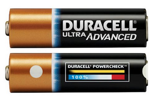
There isn't much to a battery. The positive and negative ends are fairly well differentiated. And most people understand which end goes in certain parts of their electronics. Perhaps there is some room for improvement, such as making the ends different shapes so that they can only possible fit in one orientation. The other benefit of the design is that it is very difficult to shock yourself using one of these. You cannot easily complete the circuit using your thumb and forefinger, since the resistance in your hand is too great. The only feasible way is to put the battery in your mouth.
8. Misleading doorbell panel

This doorbell has a sign underneath it labeled "BELL", with an arrow pointing to the left. Those using it reported looking to the left of the panel for a doorbell before realizing that the arrow had nothing to do with the sign.
What was the arrow for then? It pointed at the door.
9. AutoCAD

AutoCAD is a program that is used to create drawings of 2D or 3D objects. I rarely mess with the 3D side of it, but I do use it professionally, and I can say that it is a very good program, considering the number of features it has. Each time you try to take an action, it will prompt you in the command window at the bottom to supply the correct arguments, one at a time, or none.
Maybe you notice that there is an excess of buttons on the screen, but those buttons are fully customizable, so that you can have as few buttons as you like. In addition, each command can be typed if you prefer, and if you want to do something, but aren't sure if it's a feature, just try typing it out (that's how I found the area of an irregular spline).
10. SolidWorks
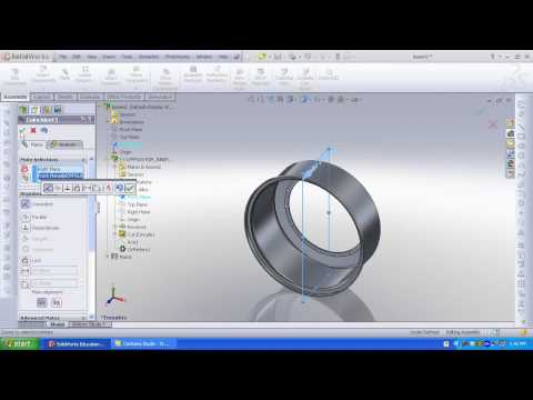
Like AutoCAD, SolidWorks is another drafting program for computers. However, SolidWorks is more tailored to 3D applications. To be fair, I won't complain about making anything 3D in this program, the 2D aspects are troubling enough. To draw a shape, you must first draw out the shape that you want it to be, and then go back and specify the actual dimensions that the shape should have. This always throws off my flow, as I prefer to set the length of an object, and then see a line of that length get drawn. I spent a semester using this for a project before I started using AutoCAD consistently, and, while I was always able to complete my design, I was always frustrated after finishing.
The outdated references were also very entertaining for me. The NES cartridge tutorial was awesome. I liked your design choices especially autocad.
ReplyDeleteI really like the stairs! They looks very cool, but I do think this is useless in real life. The reflections are really good, and I like your sentence,"A CHI blog written like a blog, not an essay".
ReplyDeleteI completely understand your reactions. Mine were quite similar. I particularly enjoyed your doorbell example.
ReplyDeleteYour chapter summaries provided some intriguing new points. My only suggestion would be to make them slightly more formal grammatically. Nice chapter six description too. Your summary was also well written, but I could not have agreed with you more on the book being too long. Reading for leisure is nice, but I also agree time pressure makes that unable to attain most of the time.
ReplyDeleteSummaries were good, but too concise. Great examples. Should have used more book vocab.
ReplyDeleteI thought you did a great job of providing us with your perspective on the chapter reactions and the overall book reaction. The examples of good and bad design could have been helped by putting them more into the terms Norman uses, but overall a great blog.
ReplyDeleteI feel like your reactions to each chapter were clear through the tone conveyed. You have a very fresh perspective, this blog was nice to read after everyone else's so far, which held similar messages. You have unique examples to, great job. Keep it up!
ReplyDeleteYour thoughts were well written and quite amusing. I actually enjoyed your blog because it wasn't like everyone else's and was thought out.
ReplyDeleteVery cool personal spin throughout chapter reactions and designs. I was a little frustrated how you meshed the good and bad designs together. Just a small organization issue, but then I got over it.
ReplyDeleteYeah, I realized that I probably shouldn't have done that, sorry
DeleteNice chapter/book reactions. Good examples and while I agree with the AutoCAD and SolidWorks evaluations, I love using both of those programs. As far as modelling goes, I think they handle 3D in a 2D space very well.
ReplyDeleteIt was a little frustrating that you put the good and bad together but overall a good blog.
ReplyDeleteUnique blog. A little odd with the alternating designs, but good descriptions and chapter summaries. Keep it up.
ReplyDeleteGood blog! I liked that you included mostly your personal thoughts on the chapters. Your examples were good, but sometimes it was a little difficult to tell if they were supposed to be good or bad.
ReplyDeleteNice summaries. The batteries are an interesting bad design choice. I know the mics in most of the rooms run off of 9V batteries. I always have to see how the previous battery was put in to make sure I have the new one in right. I can look inside the mic but only see 2 metal plates at the top. No indication as to how the batteries should be rotated.
ReplyDeleteDefinitely one of the better blogs I've read! A perfect mix of serious evaluation and wit.
ReplyDeleteDon't forget to reiterate that I messed up by alternating good and bad designs
Delete